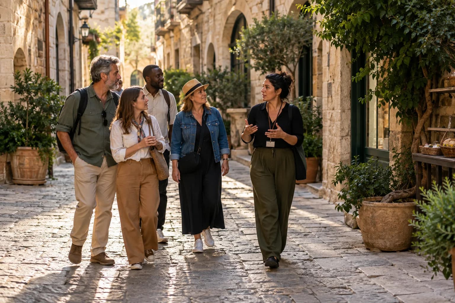
Start with the traveller's decision
A tourism website is not only a brochure. Its job is to help a traveller understand what you offer, decide whether an experience fits, trust the operator, and take a clear next step.
Organize the site around those decisions. A strong starting structure is Home, Experiences, About, FAQ and Contact, with location or category pages only when they add genuinely distinct information.
- A specific promise and location in the main heading
- Visible experience categories and starting prices where known
- A clear booking or enquiry action
- Real contact details and realistic operating information
Build complete experience pages
Every major tour, rental or activity should have a stable URL and enough information to stand on its own. Thin cards that send visitors directly to an external checkout leave important questions unanswered.
- Duration, location, meeting point and guest limits
- Highlights, itinerary, inclusions and exclusions
- Age, difficulty or safety requirements where relevant
- Cancellation terms and a useful booking label
- Accurate photographs with descriptive alternative text
Make trust verifiable
Use claims that a visitor can understand and verify. Show the people behind the operation, explain safety or guide credentials where they are real, and link to legitimate third-party profiles when available.
Avoid invented superlatives, unsupported awards and decorative review counts. Honest detail is stronger than generic social proof.
Run the launch checks
Before publishing, test the complete path on a real phone: arrive from search, open the menu, compare two experiences, submit an enquiry and return to the previous page. Then verify titles, canonical URLs, social previews, structured data, sitemap coverage and redirects.